CSS properties for more balanced typography
Ensuring your headlines and paragraphs are well balanced has been a little bit hacky on the web up until now. It’s easy to end up with an orphan word that wraps to its own line or a headline that wraps and when it wraps the top line is a little too long above the wrapped line. Luckily there are two CSS properties for text-wrap that can help solve these problems for you.
There are two properties that might seemingly do the same thing but there is difference between when to use balance and when to use pretty. Unfortunately support across browsers is not equal for both of these.
Support for text-wrap: pretty is available in Chrome, Edge, Opera and Samsung Internet. No support in Firefox or Safari.
Support for text-wrap: balance is available in Safari and Firefox. It has limited support in Chrome, Edge, Opera and Samsung Internet (text-wrap: balance works but text-wrap-style: balance does not.)
text-wrap: balance;
There is a limit on the number of lines that text-wrap: balance; will apply to but it is dependent on how many lines there are based on the width of your text. Balance will only apply to less than six lines.
In the demo below, if you open the code on Codepen in a supported browser, remove text-wrap while the width is 300px, you’ll see text-wrap has no effect. If you change the width to 600px, add text-wrap: balance; back to the CSS - you’ll see it does have an effect.
See the Pen CSS Text Wrap: Balance Limit by Stephanie Stimac 🔮 (@seaotta) on CodePen.
With text-wrap: balance;, because there’s a limit to how many lines the browser will wrap, this should only be used on headlines, headings, and subheadings. Applying it to large paragraphs will have no effect and comes at a performance cost because the browser is trying to calculate optimal balance even though it won’t apply anything.

The example above shows a comparison of a headline without balance applied and a headline with it applied. The first example doesn’t look balanced, whereas the second one does.
text-wrap: pretty;
Text wrap pretty is the opposite of balance and can be used on entire blocks of text but you’re only really going to see a difference on the last four lines of text. It’s primary use is to prevent orphans - or one word - on their own line.
The browser makes calculations to make adjustments for you. “To balance between the typographic benefits and the performance impacts, it adjusts the last 4 lines of paragraphs that meet certain conditions.” Chrome Platform Status.
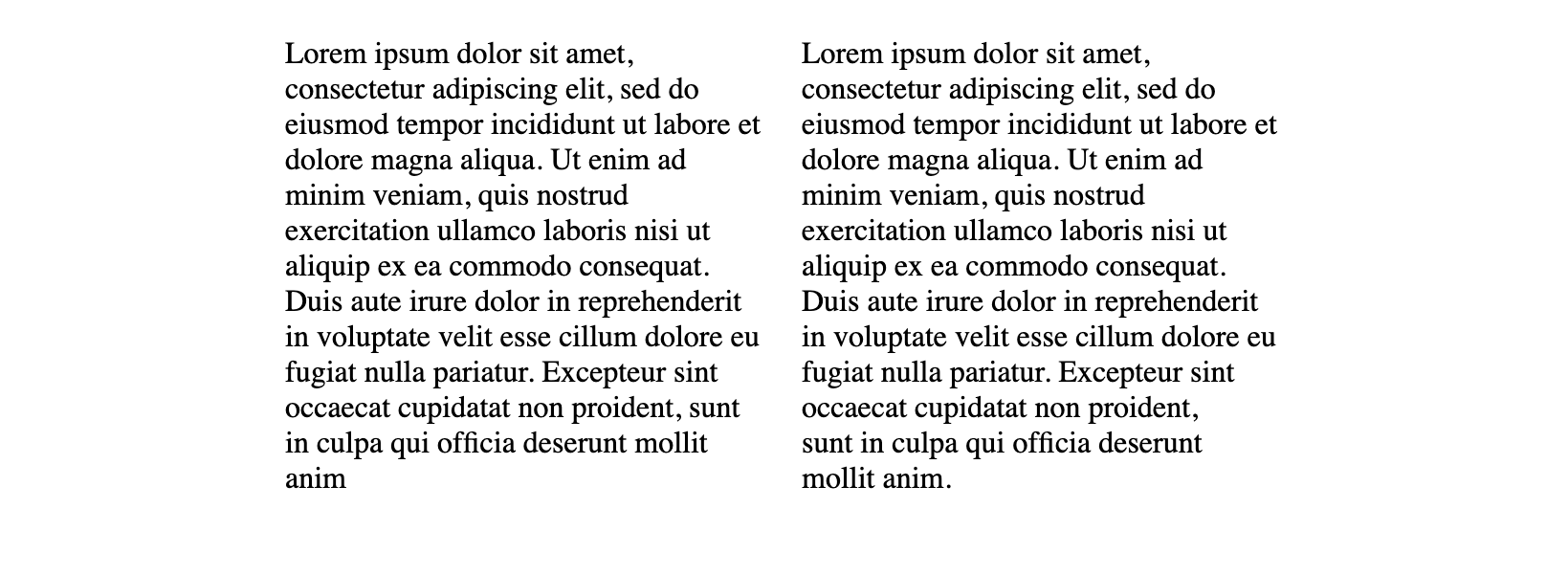
The differences are subtle when text-wrap: pretty; is applied.

In the image above, the paragraph on the left does not have pretty applied and there is one word on the last line. In the paragraph on the right, with text-wrap: pretty; applied, there are two words on the last line and you can see the slight adjustments to the last three lines to make that second word wrap.
Very subtle, but it provides a solution to avoid any hacks around trying to get rid of those orphan words that visually look out of place on their own line.
Support for pretty is again quite sparse, with only Chromium browser support. Hopefully Firefox and Safari will ship these to help improve typography on the web.
Balance and Pretty
Use text-wrap: balance; on headings and subheadings. And use text-wrap: pretty; on paragraphs of text to get rid of orphans on the last line. Despite the Chromium-only support, these would be a good candidate for progressive enhancement. It won’t negatively affect the experience if someone is not in a supported browser, but it will some visual balance to the page for those in a browser where supported.
Here’s the link out to MDN for text-wrap.
This was originally published on Stephanie Stimac’s blog at the end of 2023 but has been updated with new information.